
Designing for Global Accessibility, Part III
Be inclusive by default
In our three-part series, Google’s User Experience researchers Astrid Weber and Nithya Sambasivan discuss the principles behind building globally accessible products, and offer practical resources for the design and development community. In Part I, they outlined how designers and developers can increase their awareness of accessibility issues. Part IIexplored critical logistical considerations. Here in part three, they’ll discuss how designers and developers can make tactical UX decisions to create universally inclusive apps.
What is global accessibility? A quick recap
No two users are exactly alike. Physical and cognitive disabilities, as well as environmental factors, can inhibit people from fully engaging with technology: hardware, software, and beyond. As UX researchers, we often find similar—sometimes even identical—issues that impact users’ ability to interact with their tech; and while the restrictions across users and use cases vary, the design implications are similar. For example, bright sunshine, low vision, or a cracked phone screen can all be factors that motivate the need for better contrast ratios.
An estimated 80% of people with disabilities live in emerging markets like South East Asia, Sub-Saharan Africa, and Central America. And many of them are new internet users. Living in an increasingly globalized world means that there’s an opportunity to proactively build ethical and meaningful products that are inclusive of societies and cultures worldwide. Let’s continue that journey by learning more about designing for global accessibility.
Consider environmental contrasts like sun and shade
People everywhere use their devices in direct sunlight, but this is especially true in the global south where a large part of each day is often spent outdoors. In these settings, low-contrast screen designs are often particularly challenging for people with low vision to decipher. If the contrast between design components and the background is not large enough, important information and affordances might get lost or overlooked.
Strategies:
-
Make your app high-contrast by default—including all text and interaction design elements.
-
Sufficient contrast is defined as having contrast ratio of 4.5:1 or higher for normal text, and 3:1 for large text greater than 18p.
-
Test your application with a dimmed screen, in bright sunshine, and through the perspective of people who have low vision (by using vision simulation tools).
Resources:
Color has meaning—use it wisely
Colors have a wide variety of implications in different cultural contexts. For example, you can’t assume that the color red implies alarm around the world, as it does in the United States. In addition, more than 5% of the male population has some form of colorblindness—oftentimes undiagnosed—and may not see the color red as such. It is a best practice to avoid relying on color alone to communicate with your users, and instead combine color accents with other visual cues like bold outlines, strokes, or patterns.
Strategies:
-
Include design elements to ensure that everyone who uses your app receives the same amount of information, regardless of ability to see or interpret colors.
-
Use multiple visual cues to communicate important states of your app.
-
Utilize strokes, indicators, patterns, texture, or haptics to describe actions and content.
-
Always pair visuals and icons with text, especially on navigation and call-to-action buttons, to ensure robust access.
Resources:
Design for various screen conditions and input abilities
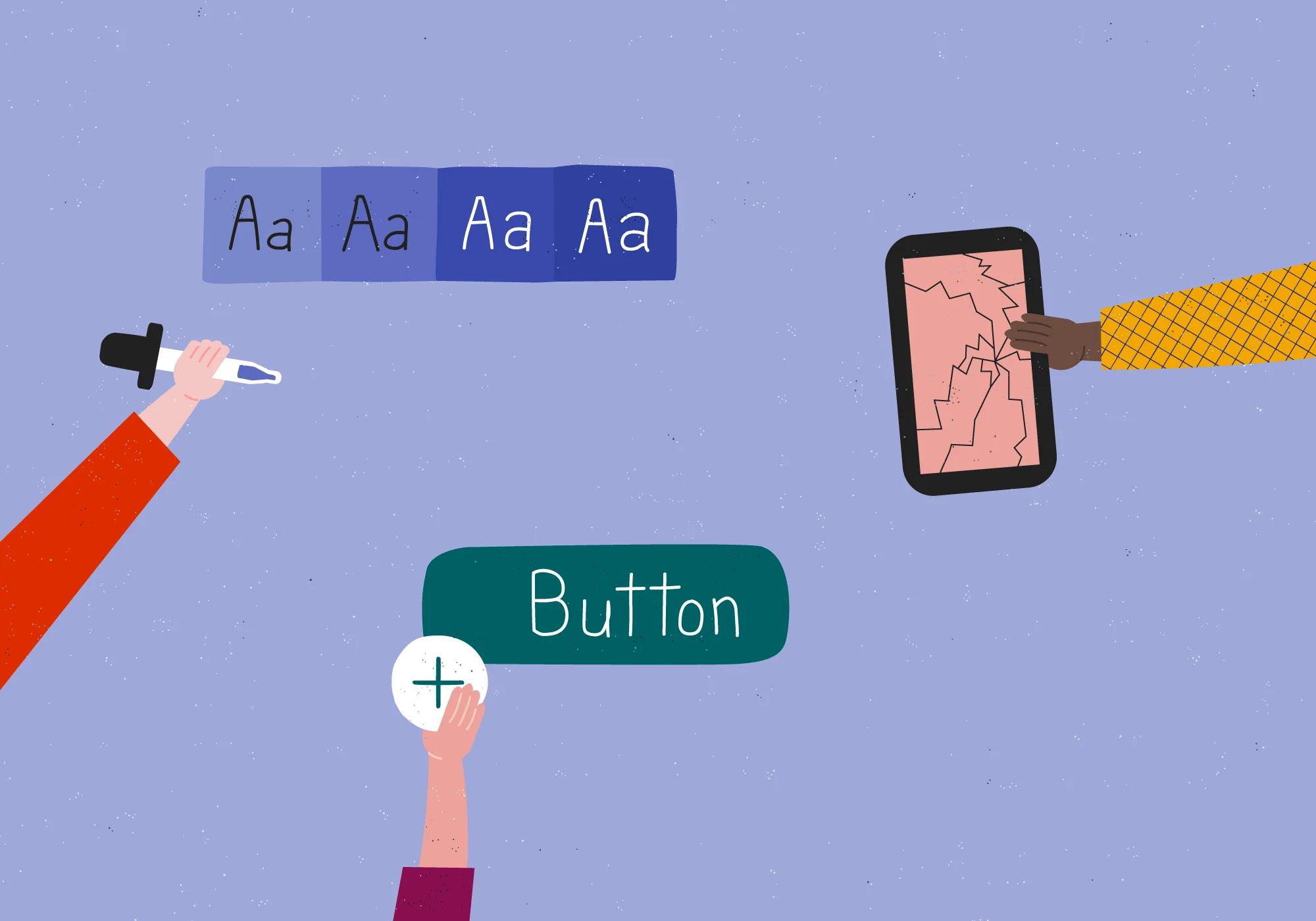
The percentage of people in emerging markets who use a phone with a cracked screen is significant, and about one quarter of users said they would continue to use their phones despite cutting their finger on a broken screen. Broken screens can make some touch targets hard to activate or entirely unreachable. In addition, users with limited hand dexterity or a tremor might struggle to reach very small UI elements.
Strategies:
- Always ensure that your designs work in both portrait and landscape mode. This ensures full functionality for people who need to mount their devices horizontally (eg. in front of their wheelchair) as well as those with broken screens with dead pixels.
- Your app should render text, dates, times, addresses, and phone numbers in the local format without cutting or overlapping text.
- Check your visual designs through the lens of magnification and zoom, as designs often break when magnified by up to 200%.
Resources:
Go big
Small-screen devices are often more affordable; their cheap price makes them popular and widely used, particularly in the global south. However, pixel quality varies widely among devices. A smaller phone with a low-quality touchscreen in combination with small touch targets can create accessibility issues for all users. Larger tap targets can also accommodate those with hand tremors and limited dexterity or those with low vision.
Strategies:
-
Remember minimum size standards for touch targets. 48x48px (or 48x48dp on Android) is the minimum recommended touch target size that helps those with limited dexterity or low vision as well as those with damaged screens.
-
Ensure that your interface scales down to 4” and up to 7"+ screens.
-
Make text and typography elements large by default.
Resources:
Inclusive design and accessible applications open the door for people across the globe to overcome barriers that prevent them from full participation with the tech that surrounds them. Indeed, thoughtful apps might empower them towards leading more fully independent lives. It is upon us as user experience designers and developers to make intentional design decisions that serve emerging internet users with disabilities in all contexts, and in all countries. Access to technology should be a global concern, and available to all.
Read the previous posts in this series: Part I, Awareness is Everything and Part II, Context Matters.