Evernote: Ideas in Action
Get to know the Material Design story behind a popular note-taking app
Creating a powerful note-taking app without overcomplicating the experience for users is a test for even the most seasoned designer. When Evernote decided to align with Material Design in 2015, the update provided the perfect opportunity to polish features and provide a more streamlined user journey. The result combines beautiful motion and typographic detail with a cleaner, more straightforward UI, emphasizing Evernote’s central concept—the simple power of capturing and organizing ideas.
Clarifying complexity through clear and clean UI
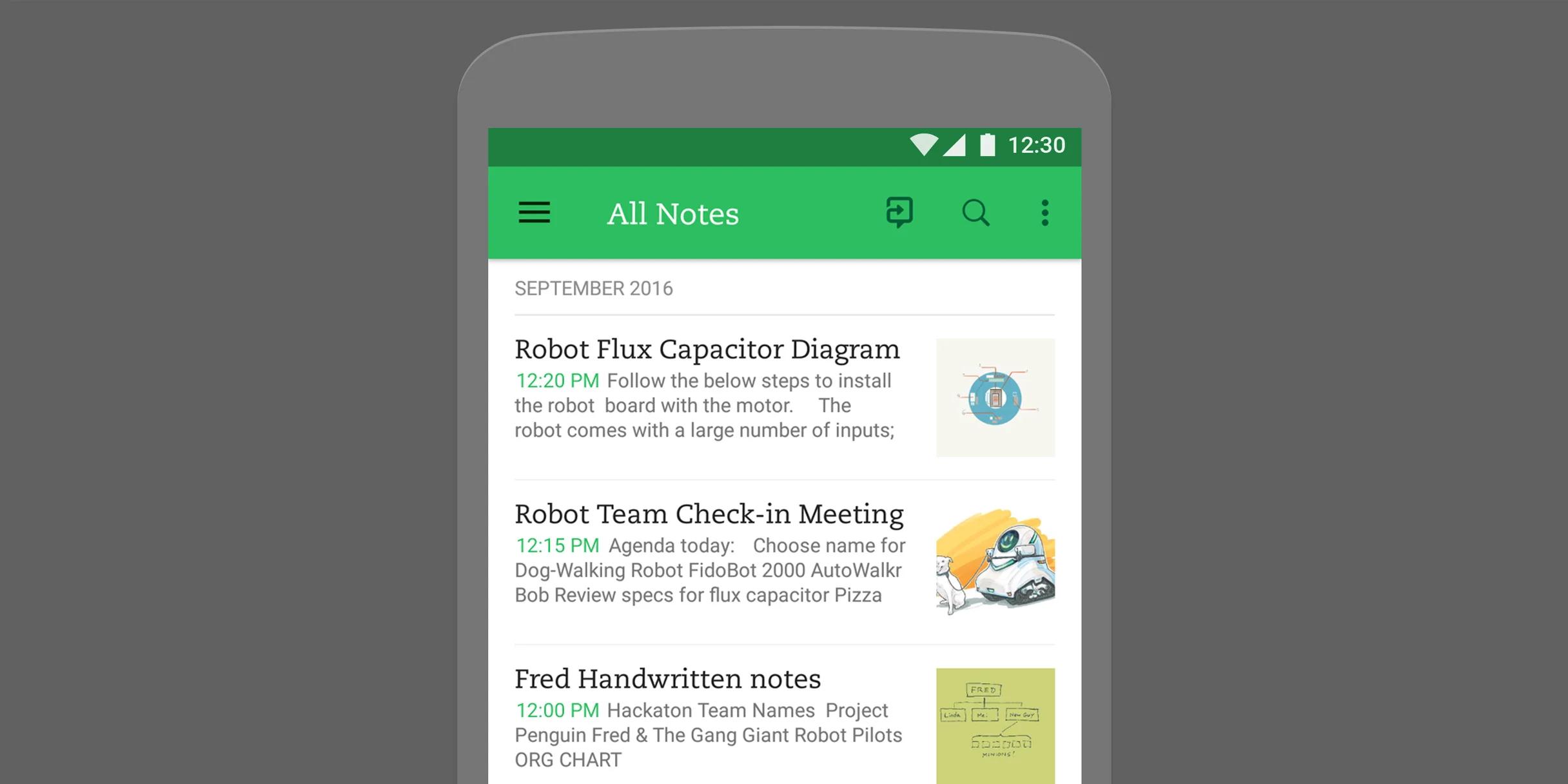
One of the greatest challenges in designing a useful note-taking product is balancing the swift capture and recall of ideas. Evernote elegantly solves for both use cases by presenting users with a green floating action button (capture), and their note list (recall) every time they open the app. The ability to jot down a new idea is a simple tap away, while previously recorded information—whether it’s a photo, audio, chat, or any other type of content—is readily accessible via the uncluttered note list. Kara Hodecker, Evernote’s product design manager for mobile, credits the switch to Material Design with minimizing wasteful distractions for users, and making notes easier to scan and edit directly from the app’s home screen.
The persistent FAB utilizes a speed dial transition—expanding on tap to display six different ways to take notes, and gently reinforcing the numerous ways users can input data and quickly communicate the depth of the Evernote product.
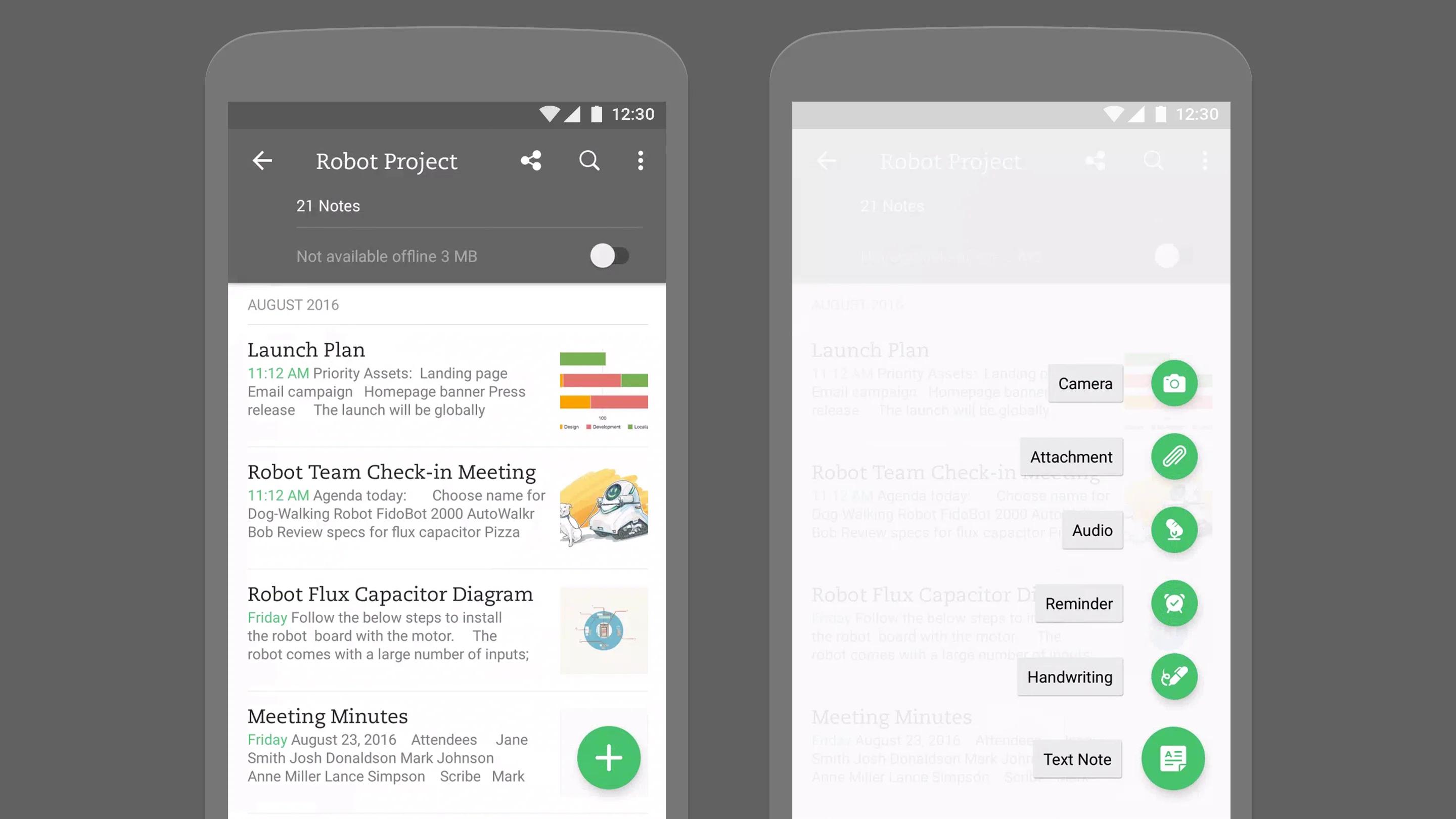
When pressed, the floating action button flings out all the various ways to take notes—educating users in the process.
Using animation to guide and delight
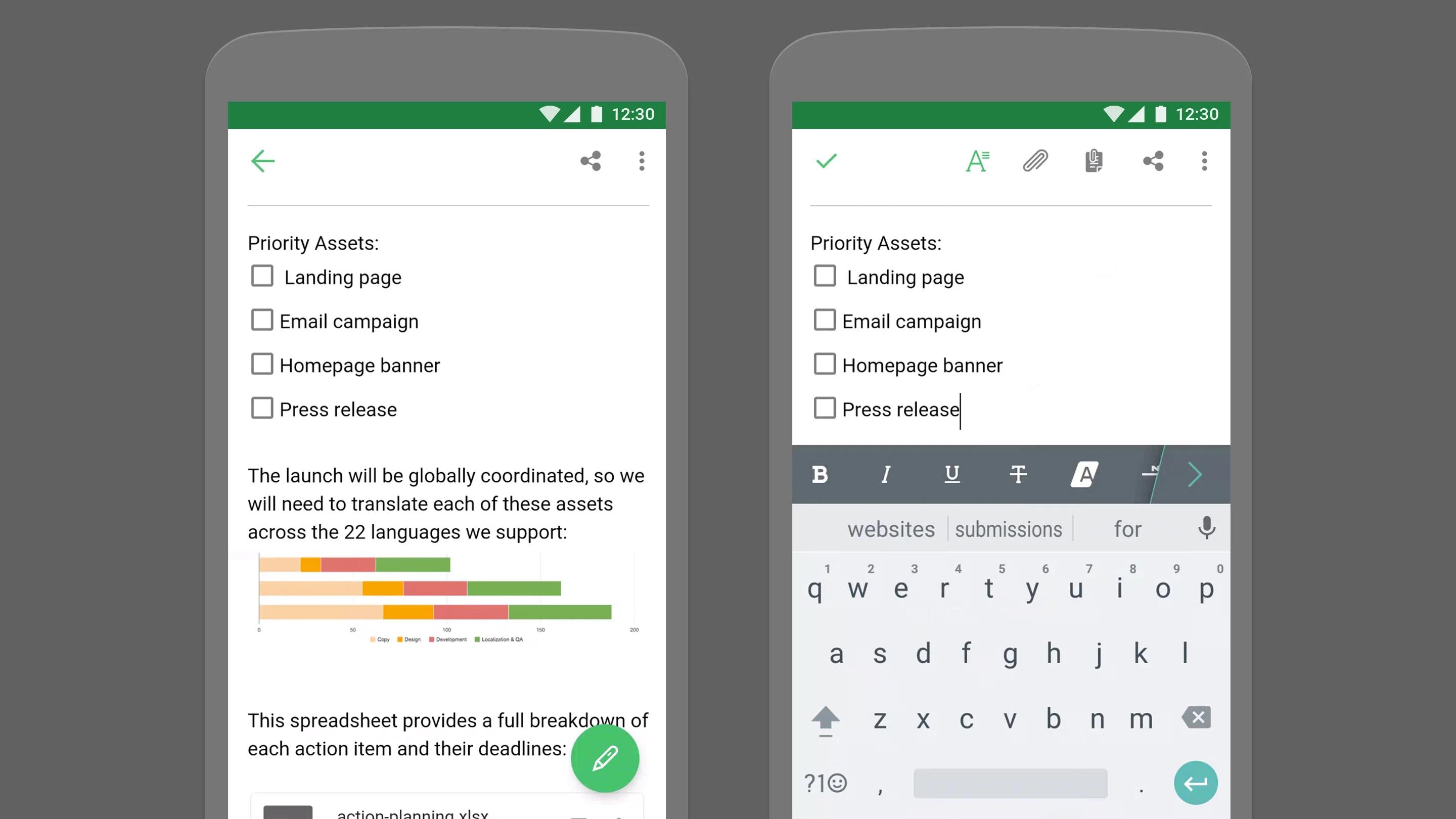
Tracking your to-do list can be stressful (not to mention project critical), so it’s imperative to put users at ease by clearly signaling when their ideas have been recorded. Evernote uses a simple and graceful animation to communicate this change. When editing a new or existing note, the up button in the upper left-hand corner shifts from an arrow to a check mark. When editing is complete, tapping the check mark triggers a short animation of the mark transforming back into an arrow, or up button—a gesture that lets people know their work has been saved and it’s safe to return to the note list. Justin Street, Evernote’s Product Manager, cannot emphasize motion’s value enough—from reassuring users, to simply making them smile.
Evernote uses animation to let users know their work has been recorded (and to surprise them with a simple moment of beauty).
Reinforcing brand and usability with typography
Any typeface can work in the Material Design system, as long as the foundational elements—grids, space, scale, color, imagery, typography—are used systematically to guide the overall design. In fact, the flexibility of the guidelines is intended to allow individual brands to express their identities. According to Street, Evernote chose a conscious balance between creativity outside of and adherence to the system, in order to express their own identity and also to to take full advantage of the net user experience that comes with implementing Material Design.
The careful use of typography throughout the app, creates a clear sense of hierarchy and infuses it with character. Caecilia, Evernote’s system font, pairs well with Roboto, the standard sans serif available on Android. The design team chose to use Caecilia for headlines and higher-level information and Roboto for body copy, UI elements, and everything else. The pairing creates satisfying variation in size and scale, allowing users to easily digest information and navigate from to-dos to project lists effortlessly. The pairing of a unique typeface and the default platform font also helped streamline development; because Roboto ships with Android, it didn’t need to be added separately and expanded language support was already built-in.
Awards and growing community support
Evernote has cultivated a passionate and loyal community of users, and maintained their following throughout the transition to Material Design. Feedback since switching to Material Design has been overwhelmingly positive, with a 4.6 average rating and well over 1.4 million reviews (and counting). Evernote was named Best-in-class Design by Google Play in 2015, and consistently tops lists of the best Material Design apps. In fact, an added bonus for moving to Material was a bump in press coverage, particularly outlets who enthusiastically cited “enhanced user experience” and the “beauty of Material Design.”