Material Design Awards 2015
Recognizing the best-in-class designs from around the community
Google revealed the material design system to the world one year ago at Google I/O 2014. Since then, our Material UX team has watched excitedly as designers and developers have begun to implement our guidelines across platforms and products, delivering material experiences to millions of users. While we are delighted and humbled by the positive reception, we recognize that good design is never done, and we are committed to expanding and improving the system based on feedback from our community of makers.
In that spirit, we want to recognize the individuals, teams and companies that have made the promise of material design that much more of a reality with our first-ever Material Design Awards. The Material Design Awards encourage and recognize excellence in applying material design in the creation of engaging user experiences, and are highlighted in a collection on the Google Play store. The six winners honored at this year’s Google I/O conference represent best-in-class applications of specific aspects of material design.
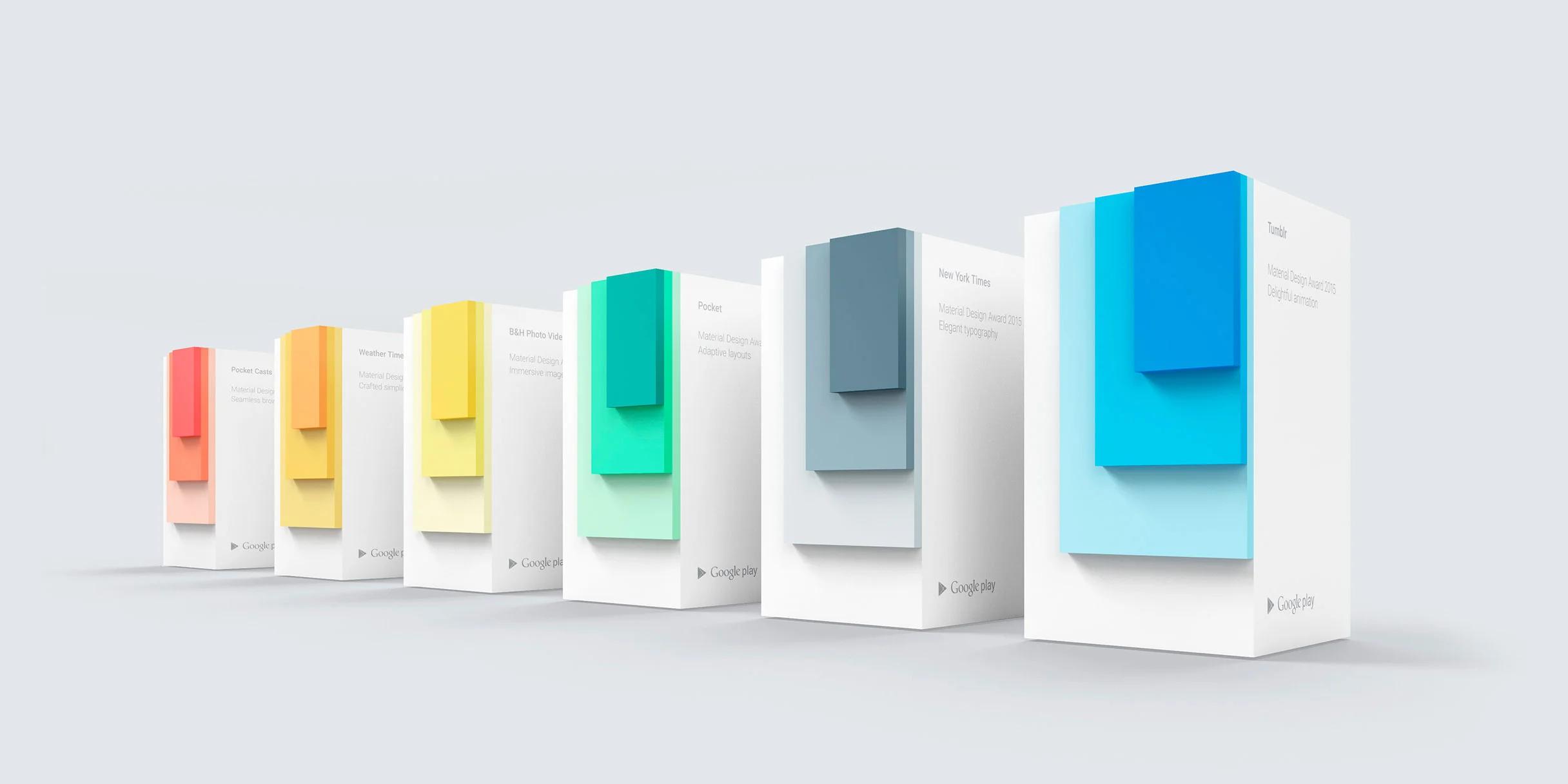
Design highlights from the six Material Design Award winners, as well as other exemplary designs from the Material Design Showcase on Google Play.
Adaptive Layouts: Pocket Crafted Simplicity: Weather Timeline Delightful Animation: Tumblr Elegant Typography: NY Times - Latest News Immersive Imagery: B&H Photo Video Pro Audio Seamless Browsing: Pocket Casts
Winner: Adaptive Layouts
Pocket, by Read It Later
Pocket implements material design to make navigation easy and clear across its mobile apps on phone and tablet. Watch the video
Pocket’s design moves deftly between phone and tablet. Lists with full-bleed imagery on phone transform into a neatly organized grid on larger tablets, with cards spanning multiple columns as needed. The tablet cards add additional information, while still maintaining a strong connection to their phone siblings.
The app’s navigation is similarly adaptive. The navigation drawer’s contents are organized hierarchically, and clearly indicated by icons and text. On tablet, a secondary panel opens from under the main drawer for selected categories. This avoids having to navigate to a dedicated view for these items, and gives the perception of reducing overall hierarchy. The “Save it now, read it later” functionality respects the user’s time and attention, enabling the user to read articles and watch videos at their leisure, free of other distractions (and even offline.)
Winner: Crafted Simplicity
Weather Timeline, by Sam Ruston
Weather Timeline uses carefully considered typographic scale and bold color choices to add interest to their app. Watch the video
Weather Timeline ably demonstrates how a focused app can exhibit many of the principles of material design. Typographic scale draws the eye to the most relevant information, making it easier to scan. Data visualizations and map overlays are clear and uncluttered. Bold color choices add visual interest without adding noise, and colors are completely customizable as well.
As you spend more time with Weather Timeline, further refinements reveal themselves. Forecast icons gently animate. The moon viewer supports an unexpected swipe to wax and wane your way through its phases. A graph of temperature readings responds to the user’s touch by displaying exact values. Taken as a whole, all of this attention to the little details results in a richly satisfying experience.
Winner: Delightful Animation
Tumblr, by Tumblr, Inc.
Tumblr employs thoughtful animation and transitions in their app. Watch the video
It can be challenging to use animation appropriately, and even more so when your main goal is to reduce barriers between users and content. Tumblr’s choreography focuses on users’ needs, with smooth transitions throughout the app. Basic blocks of key views appear quickly, with layers of detail loading progressively. The pace of each animation is well-balanced, either brisk or gentle depending on the context.
Tumblr’s most eye-catching transitions are reserved for core use actions such as creating a new post. A touch causes the floating action button to quickly burst open with more specific options expanding radially from the center point in sequence. Simultaneously, the button’s own icon cleverly transforms into a cancel action.
Winner: Elegant Typography
NY Times - Latest News, by The New York Times Company
The New York Times goes beyond print in their material app. Watch the video
The NY Times - Latest News app builds on the typographic heritage of The New York Times. Multiple typefaces coexist harmoniously and reinforce the brand’s identity; even as the toolbar’s masthead scrolls away, the user knows precisely the source of their news. Scale and weight create hierarchy within each view, helping the eye scan easily from article to article.
The NY Times app goes beyond its design lineage in translating from print to digital. Giving the text a more varied range of greys supports each page’s layout while remaining highly legible. Subtle shifts in color are used to denote previously read content, avoiding the need to introduce indicator icons or background tinting which would detract from the refined presentation.
Winner: Immersive Imagery
B&H Photo Video Pro Audio, by B&H Photo Video
B&H; shows off their amazing inventory with clear and accessible design. Watch the video
The description for B&H’s photo/video catalog app properly notes “images tell the story - and it’s a story you’re going to want to hear.” Their product inventory is sumptuously detailed with hi-res photography. Users can quickly switch between product views from many angles, or zoom in to see fine details, giving the ability to fully inspect every aspect of the item they’re interested in purchasing.
B&H gracefully employs illustration where the specificity of product photography isn’t desired, such as images for the different departments within their store. These category graphics are consistently styled, presenting scenes which emphasize a single representative element. The overall color palette is expansive but coherent, and even the treatments for empty states in search results and other sections are well considered.
Winner: Seamless Browsing
Pocket Casts, by Shifty Jelly
Pocket Casts uses material design to make browsing podcasts a beautiful and efficient experience for the user. Watch the video
Both new and experienced podcast listeners are in good hands with Pocket Casts. The app takes a massive catalog of shows and organizes them into views which entice rather than overwhelm. The “Discover” feature presents an array of collections (featured, trending, top rated, etc.), showcasing each of them in a slightly different format to help establish a sense a place within the app.
Pocket Casts’ use of material surfaces support the efficiency of browsing. The left navigation drawer pins open on tablet, and bottom sheets provide quick previews which naturally transition into full-screen views upon scroll. A podcast’s title graphic is used to bridge the animation between the set of subscribed podcasts and an episode list, providing the accent color for that view.
In addition to the Material Design Award winners, twelve more products have also been recognized for their achievements in design through the Material Design Showcase: Buzzfeed, Circle for BitCoin, Evernote, GroupMe, Indiegogo, The Hunt, Instacart, Lyft, Runtastic, Series Guide, Telegram, WiMan
All of these apps can be downloaded through the Material Design Showcase on Google Play. We look forward to continuing to recognize the impressive design accomplishments from the community, as we evolve the material design system together.
Congratulations to all the honorees!