Reimagining Google Fonts
The new Google Fonts makes it easier than ever to browse our collection of open source designer fonts and learn more about the people who make them
Google Fonts first launched in 2010 as an engineering initiative to move the web forward and make it faster—using different technologies like cross-site caching of fonts and smart compression tools—and more expressive by creating a simple way to add more typographic variety to websites. We originally released 14 open source fonts supporting Latin scripts. Today, Google fonts are viewed on the web over 15 billion times a day in over 135 languages worldwide. Over the last six years, the team has continued to commission new fonts, adding dimension and range to the directory. Now, Google Fonts is taking its commitment to design one step further with an updated directory—one that showcases typography and type designers while making fonts easy to explore and use. Using the Material Design framework, we created a design that scales across different screen sizes and devices, and updated the entire look and feel of the site, from the overall interactivity all the way down to the logo design.
HTML5 type specimen
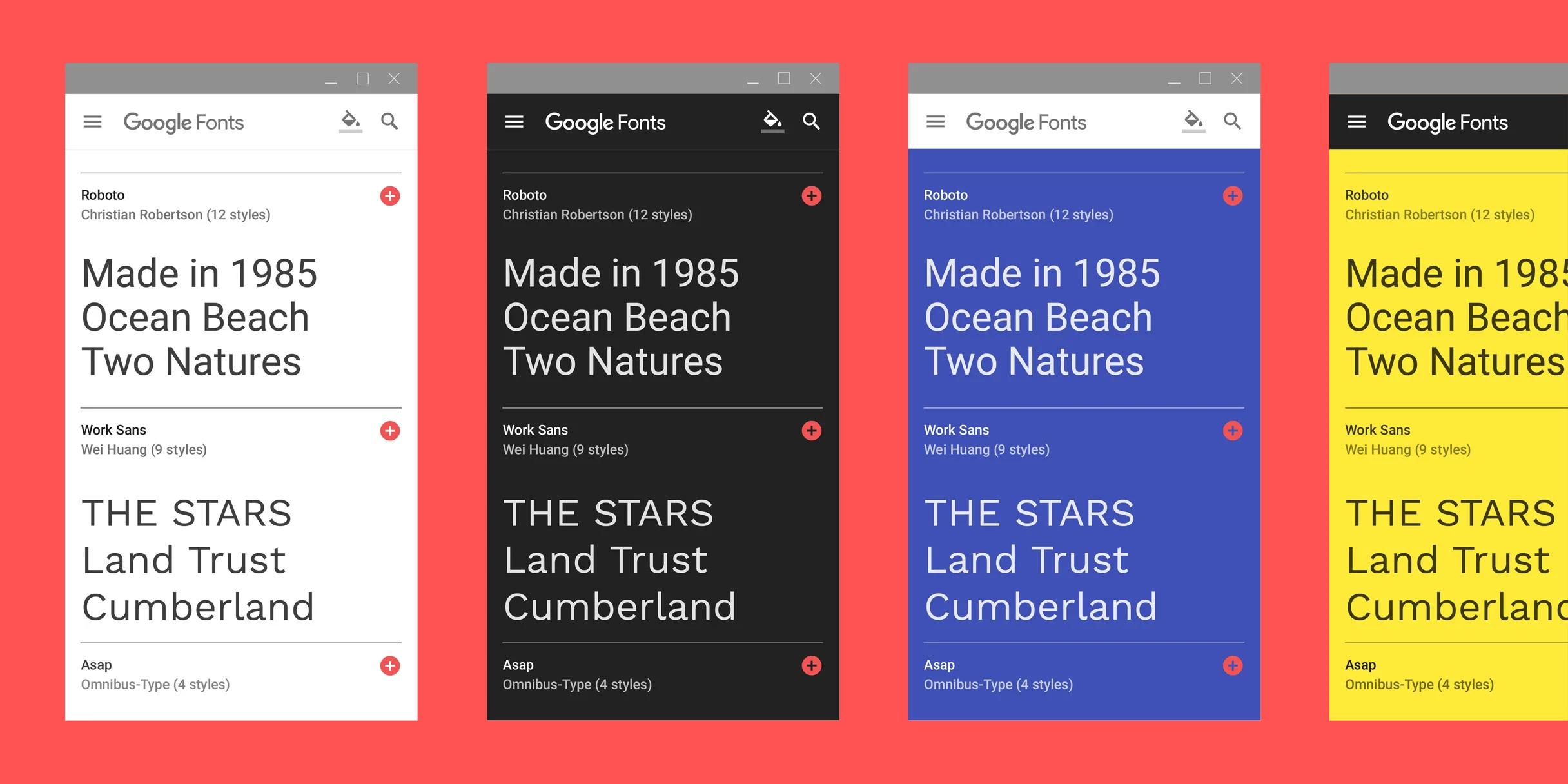
One of our foremost goals with the redesign was to make Google Fonts a more visually engaging design resource. The type specimen was conceived with an eye toward creating a dynamic and playful way for people to explore various font families. By building in the ability to play with scale, color, and font pairings, we invite everyone to discover and seamlessly use typefaces in their projects. Adding a layer of interaction and experimentation, as well as including information about the typography, type designers, and analytics for each font, allows users to connect with the typography on a personal level.
The grid
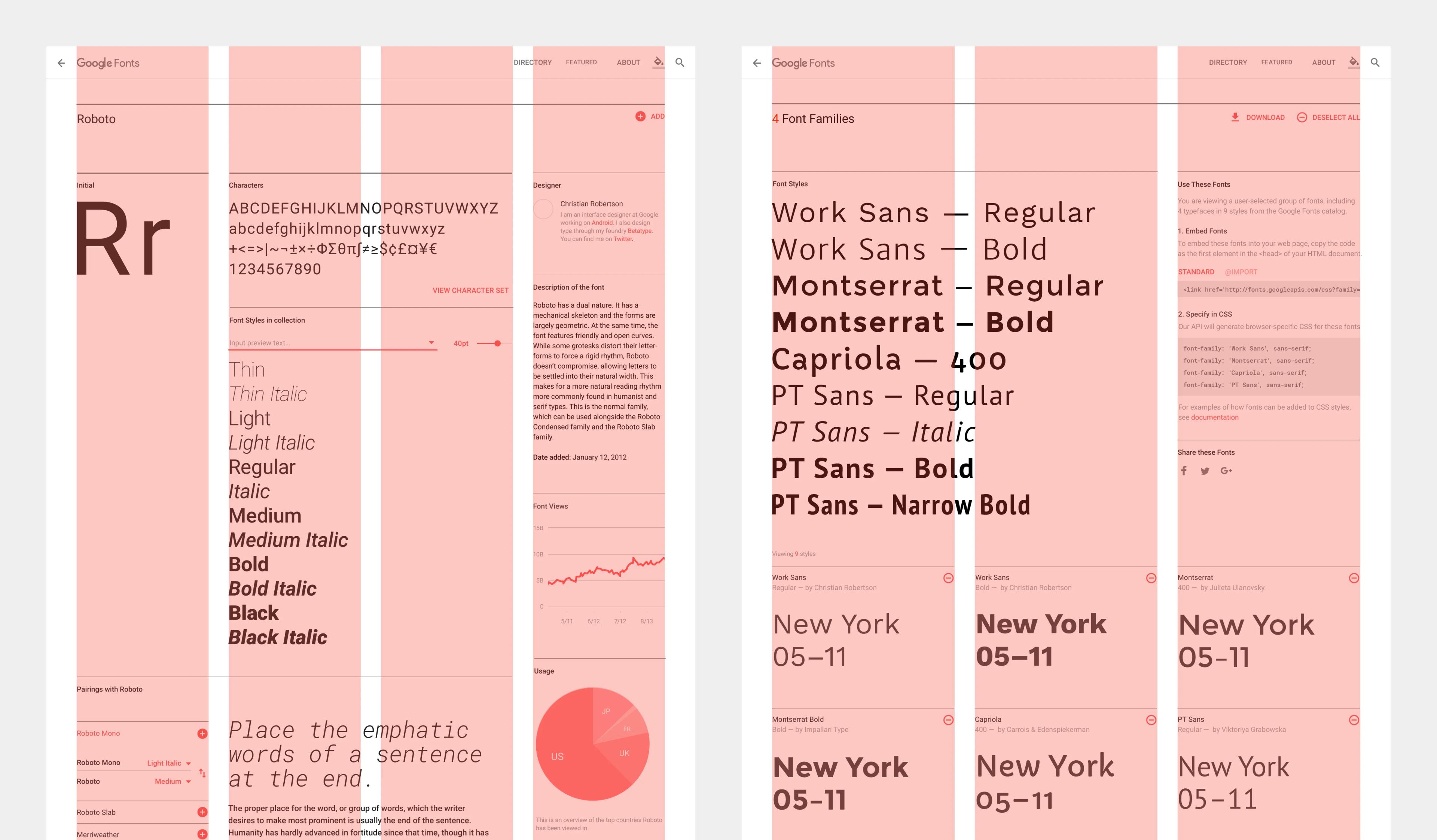
The grid system adapts to accommodate different layouts with a consistent 40dp column gap.
The flexibility of the Material Design grid system allows different types of content and page compositions to live harmoniously throughout the site, while maintaining a consistent visual rhythm. For example, modules like font pairings in the specimen pages require more real estate, so the specimen page is set on a four-column grid; the featured collections, on the other hand, only need a three-column grid. It was only after experimenting with several different layouts and content typologies that we discovered the grid view to be the most versatile approach for showcasing each font family.
Adaptive UI containers
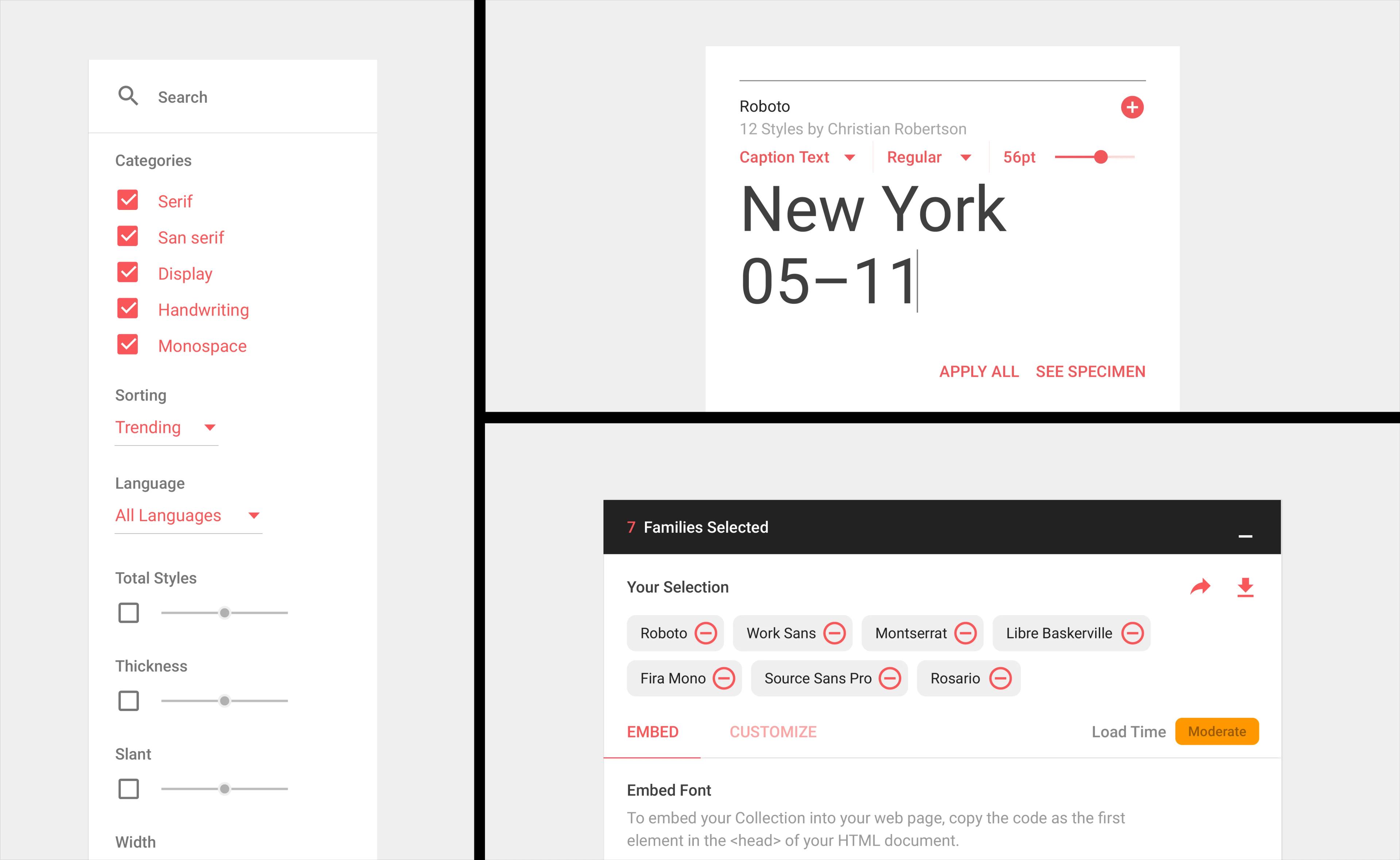
Left: All of the search & filter controls are consolidated into a single panel, which allows for full-screen browsing with a single click. Top right: The font family modules use a localized toolbar, which appears on hover and allows people to interact with the type. Bottom right: The selection drawer can be accessed any time during a session to show selected fonts.
To optimize the browsing experience while keeping basic features like search, filter, and editing accessible, we designed the UI containers to adapt to different user flows. The search panel on the right allows people to explore the “Search & Filter” feature and can be dismissed with a click to return to the immersive, full-screen browsing experience. A localized toolbar affords editing sample text easily, allowing you to add in your favorite pangram or your company’s name, for example, and see it rendered in your selected font styles. The option to apply your changes and preview them across all font families is also available by simply selecting “Apply to all.” It’s a hands-on, playful way to interact with and personalize the type. The font selection bottom drawer is accessible anywhere in the directory without additional navigation, making important information easy to reference at any point in a session.
Design is always evolving
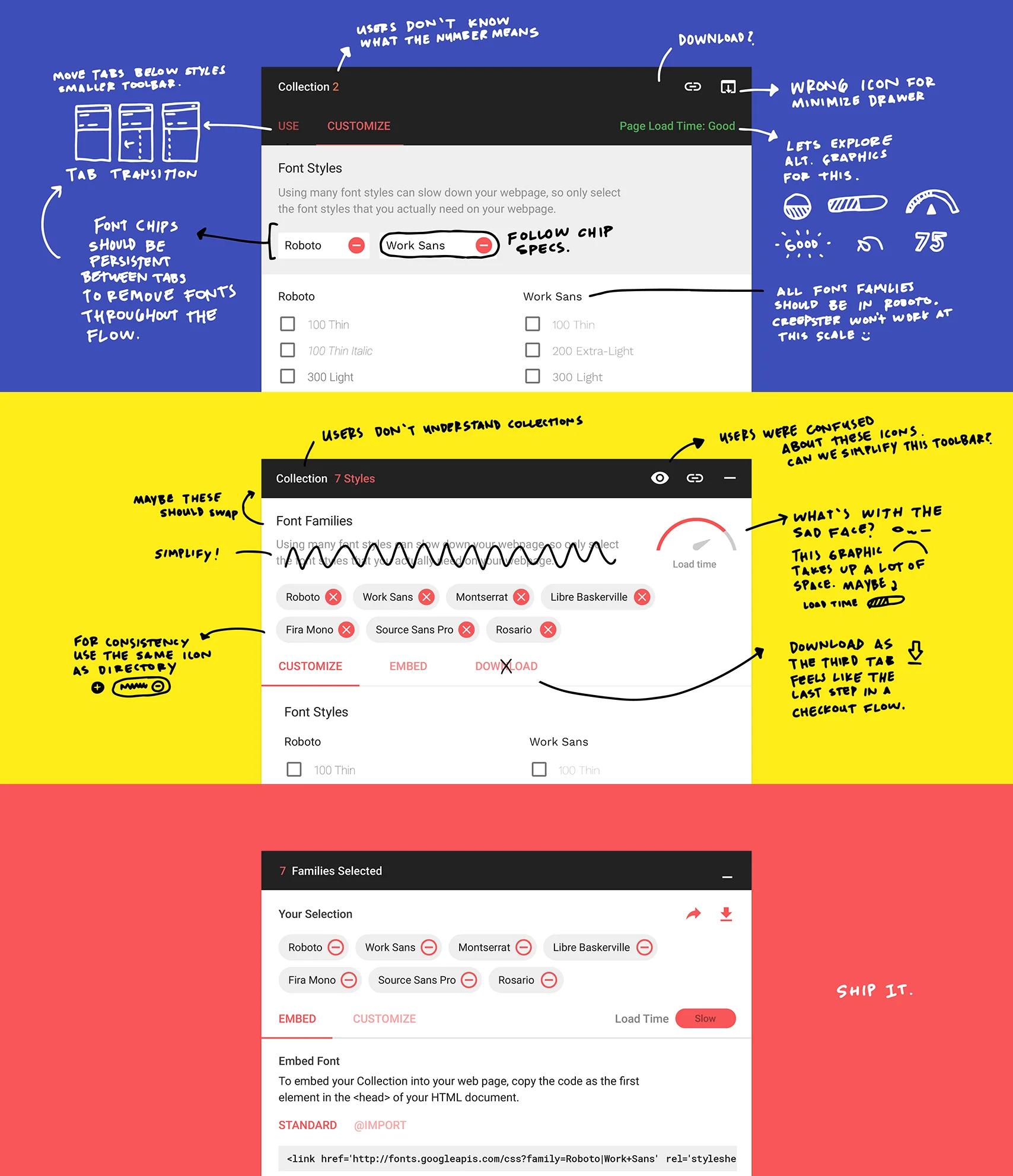
Google Fonts was already one of Google’s most popular APIs, so it was important that in bringing Material Design to the site, we continued to support all the features people have come to know and love. The fonts selection and usage flow, for example, was a huge collaborative effort for the team, because we needed to satisfy the desire to serve web fonts in the most efficient manner possible, while also incorporating all our aesthetic values with the redesign.
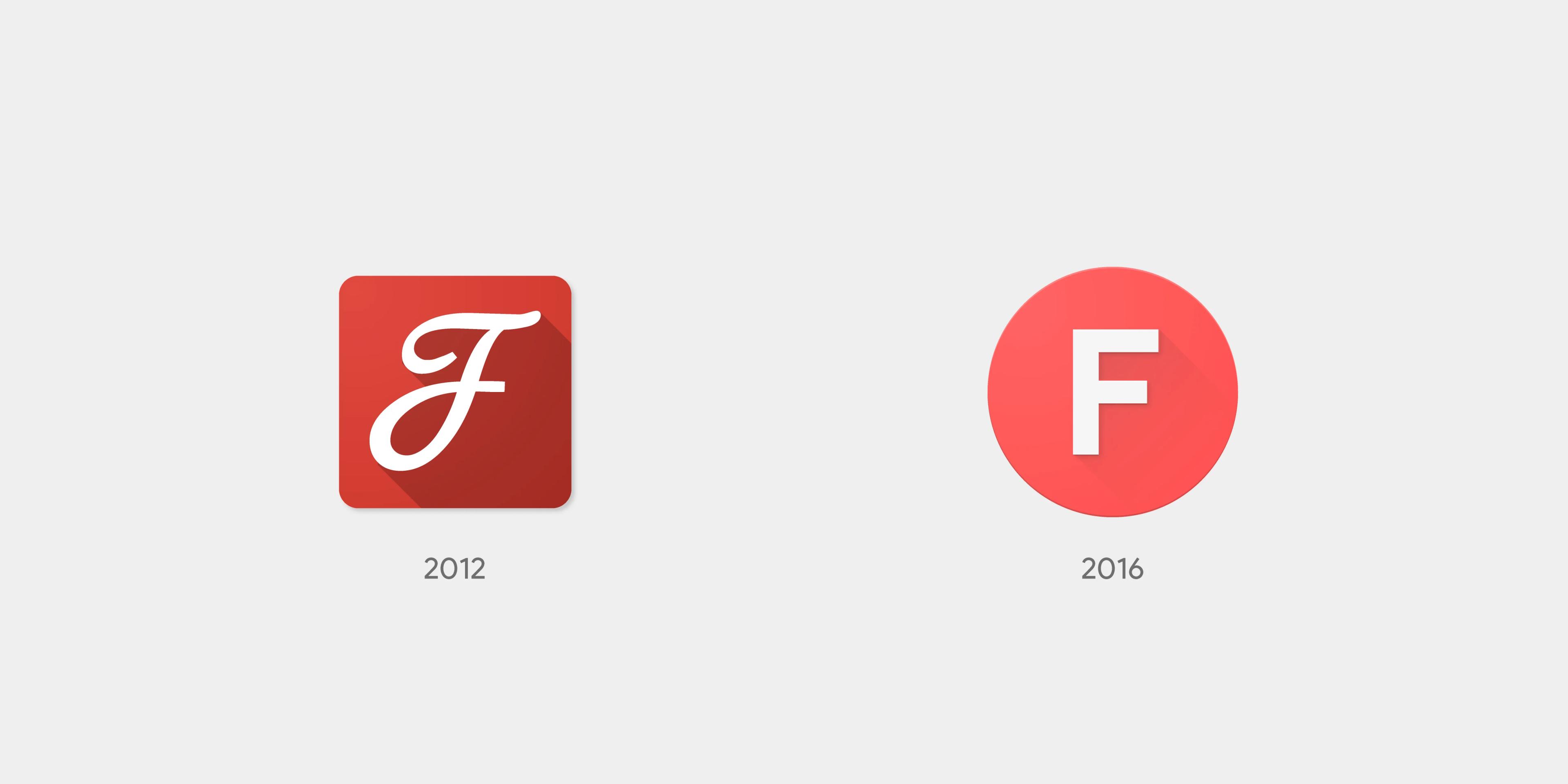
For the new logo, we updated to a sans serif uppercase F and pulled a bright red from the Material Design color palette.
As a designer, there’s an immense sense of joy and reward in seeing your team’s ideas come to life. The designer’s role is to drive toward the details with passion, solving a variety of creative problems along the way. It’s an iterative process, one that requires input and engagement from a huge team with a variety of expertise. The new Google Fonts is the work of a talented team of designers, engineers, product and program managers, writers, and researchers. We hope that you're as excited as we are about the new Google Fonts, and that these new features will inspire you to dig in and start building!